Kindle Icon Library
2023–2025Designing and shipping a single icon library for Kindle's e-reader, mobile apps, and shopping surfaces, with system guidance that keeps the language coherent as it grows.
Kindle’s icon system had no system at all.
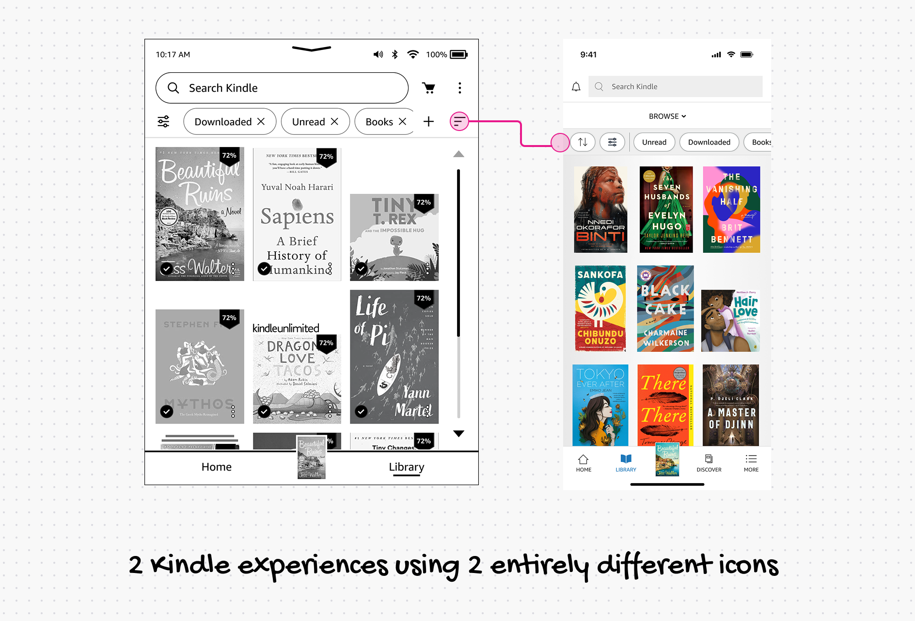
Three separate icon libraries had accumulated across the product: one for the iOS and Android app, one for the e-reader, and one for the Amazon shopping side of the experience. Each had been built independently, at different times, by different teams. The result was exactly what you’d expect: inconsistent stroke weights ranging from 1px to 2px within a single app, no shared keylines, mismatched visual weights between surfaces, and icons that weren’t even SVGs, meaning they couldn’t scale cleanly across screen densities.
There was also no reliable process for making new icons. If a team needed something that didn’t exist, they’d either improvise or pull from an existing library that wasn’t designed for their surface. The inconsistency compounded with every new icon added.
When I looked at the full picture, the shopping side used 2px icons on one keyline system, the e-reader used 2px icons on a different keyline system, and the app was all over the place. Three products that were supposed to feel like one Kindle experience, each with a visually distinct icon language.
The approach
I set out to design a single comprehensive library that could serve all three surfaces: reading, shopping, and app navigation.
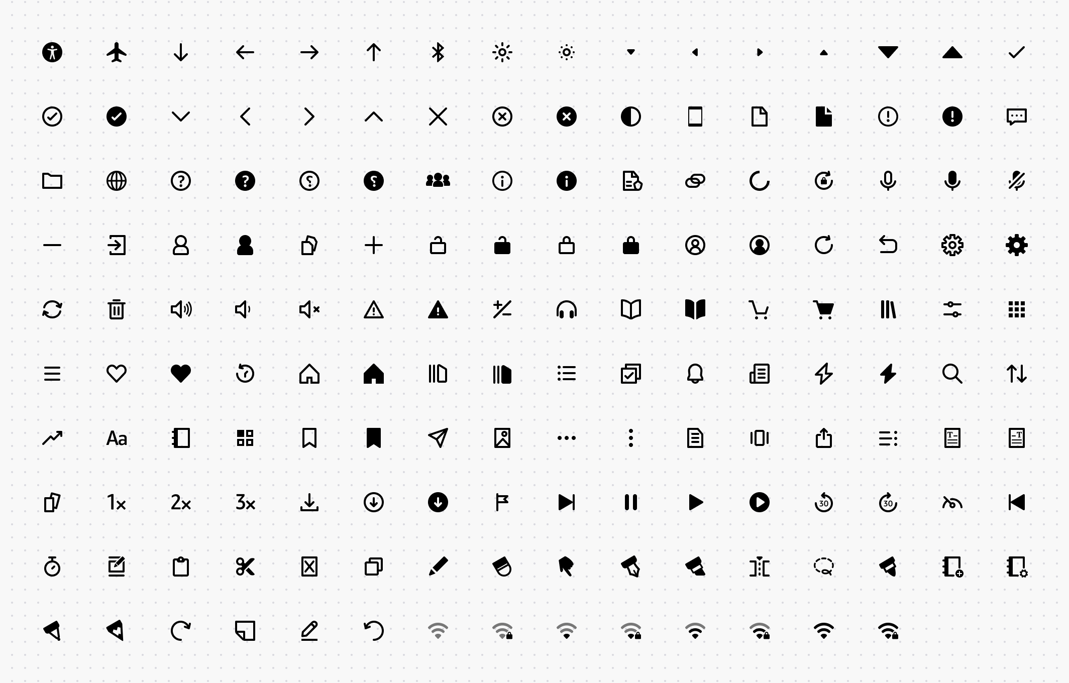
Before drawing a single icon, I established the foundation: unified keylines, a consistent 2px stroke weight across the board, and a clear rule set for how icons should behave at different sizes and on different surfaces.
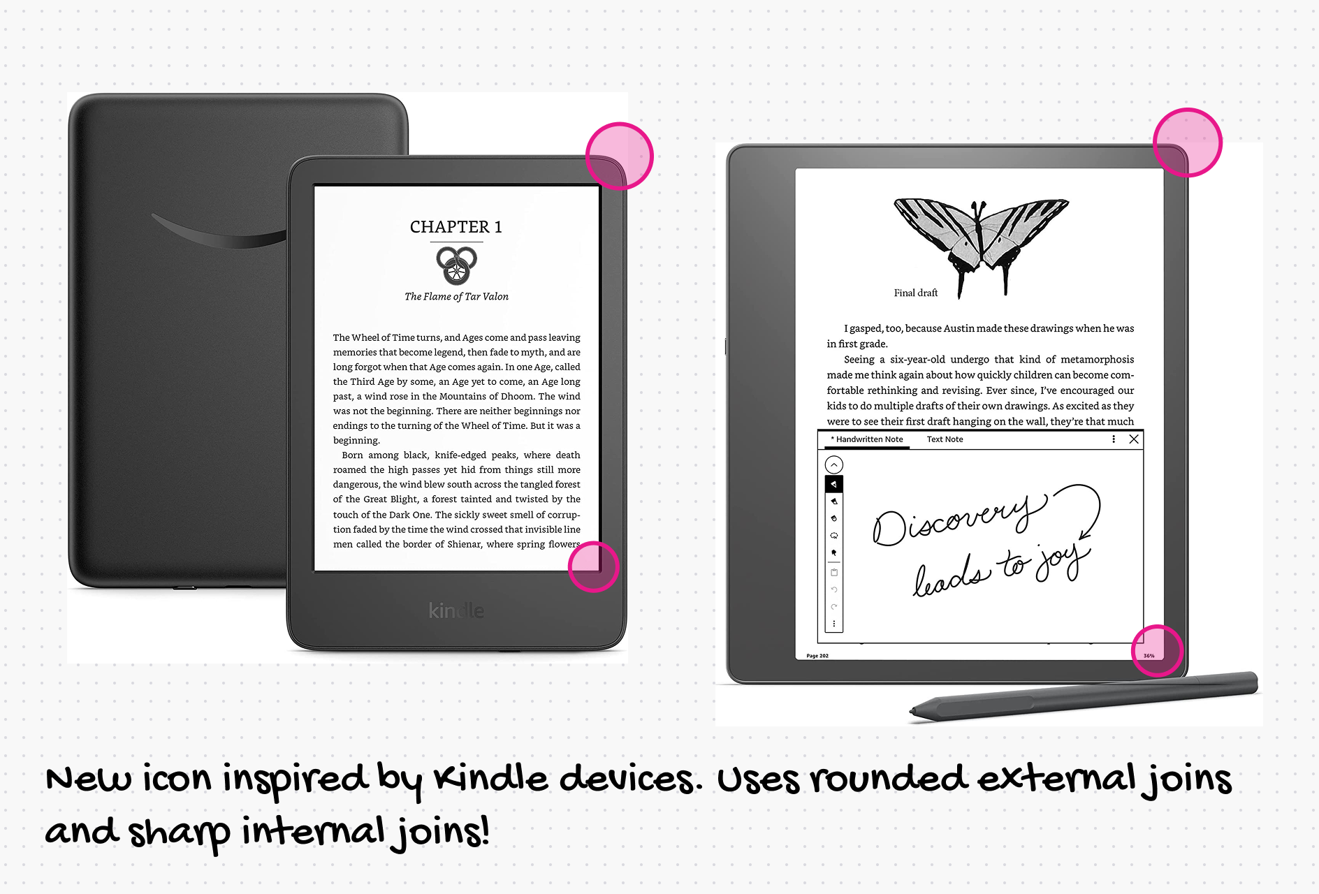
The icons were inspired by our e-reader display, with soft external corners and sharp internal corners. They were also optimized for the rendering constraints of each surface, including e-ink, which has its own requirements around stroke weight and fill to render legibly on low-refresh screens.
Then I designed 100+ icons. For each one, I made three to four variations and ran cross-functional reviews, getting feedback from engineers, other designers, and product partners before any icon was finalized. The process was deliberate. An icon library is infrastructure. Getting it wrong costs everyone for a long time. Here’s a small set of icons that were discarded.
What shipped
A single consumable library, published and in use today across all three surfaces: the Kindle e-reader, the iOS and Android app, and Amazon.com’s Read Sample experience for books.
Over 50 million Kindle customers interact with these icons every month on devices alone, not counting Amazon.com traffic.
The library also ships with guidance for making new icons: keyline templates, stroke-weight rules, and do’s and don’ts so teams can extend it without fragmenting it again. The final published guidance and resources live on the internal design system site.
Why it matters
Icon libraries are easy to undervalue because good ones are invisible. Users do not notice that the stroke weights match across surfaces. They just feel like the product is coherent. The absence of that coherence is what they would have noticed, and for a product with 50M+ monthly users, that’s a lot of small trust moments that either add up or erode.
Credits
While I led the creation and design of the revamped icon library, it took a village to bring this to life. Credits go to some of my favorite people - Sam Tobias, Sarah Sinclair, Stewart Murrie, Christopher Michon, Rebecca Crimmin, Amber Hahto and many other designers who have since contributed many more icons to the library.