Kindle Navigation Redesign
2024–2025Redesigning Kindle's navigation patterns across platforms to improve discoverability and reading flow.
Context
Kindle has been shipping for over a decade and that history showed up in the navigation layer.
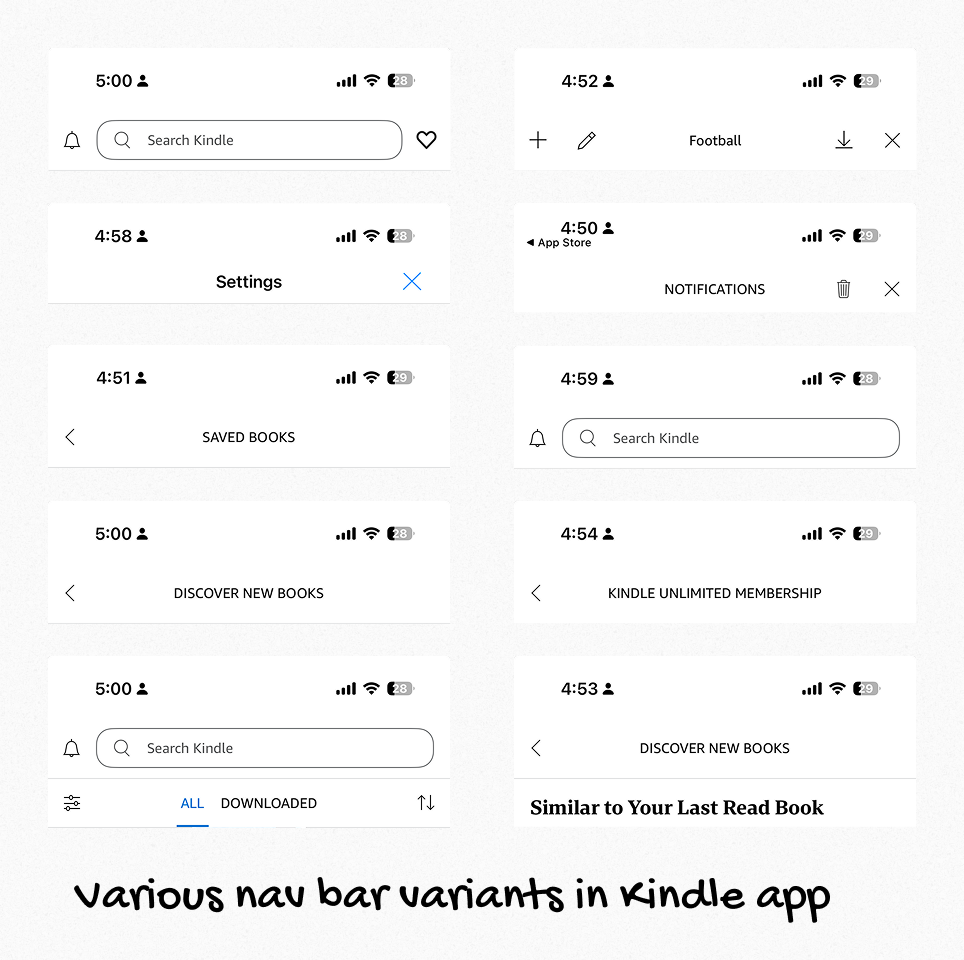
Across iPhone, iPad, Android, and Android Tablet, navigation had gradually fragmented into a collection of custom patterns, legacy components and one-off solutions. Web views sat inside native screens that weren’t as performant. Multiple nav bars coexisted without a shared logic with each team creating a slightly different variant. The tab bar had become difficult to maintain with a bunch of custom elements and navigation. Visual foundations like iconography, type and color had drifted long enough that no single source of truth really existed anymore.
On iPad, the problem was even more visible. The app largely behaved like an enlarged phone experience rather than a product designed for the device. It worked but it did not take advantage of the larger canvas or align with how customers navigate modern tablet apps.
This project was about more than making Kindle feel newer. It was about rebuilding a foundational interaction layer so the product could feel more trustworthy, more coherent and easier to evolve across platforms.
The Challenge
The work sat at the intersection of product design, systems design and platform constraints.
We were modernizing navigation inside an aging codebase where reliability mattered as much as visual quality. Other teams had active work in flight which meant the redesign could not become a disruptive rewrite and it would be a very large amount of scope to take on. At the same time, Kindle’s broader visual foundation was being refreshed in parallel, so navigation had to work as both a customer-facing improvement and a systems-level reset.
One of the hardest decisions was how closely to align with native platform patterns.
In principle, I wanted the iPad to have a true native sidebar and take advantage of the sidebar adaptable provided by Apple. That would have been the cleanest end state. For a content management app like Kindle, having the Sidebar handy would allow customers to maintain and organize their collections of books. In practice, Kindle needed to support older platform versions. Adopting a fully native sidebar adaptable model would have forced us into maintaining separate forks of the experience for different OS generations. That would have increased product and engineering complexity at exactly the moment we were trying to reduce it.
While we wanted to get to sidebar adaptable, we decided it wouldn’t be a P0 requirement.
So instead of designing the purest solution, we made a decision wherein the iPad would use a sheet that behaves like a sidebar. This would give customers the structural benefits of persistent library-oriented navigation while preserving compatibility and creating a clean migration path toward a native sidebar later.
That tradeoff captures the core of the project. The work was not about chasing the newest pattern for its own sake. It was about making the right long-term decision under real constraints supporting customers with older OS and providing us a foundation to make gracious updates.
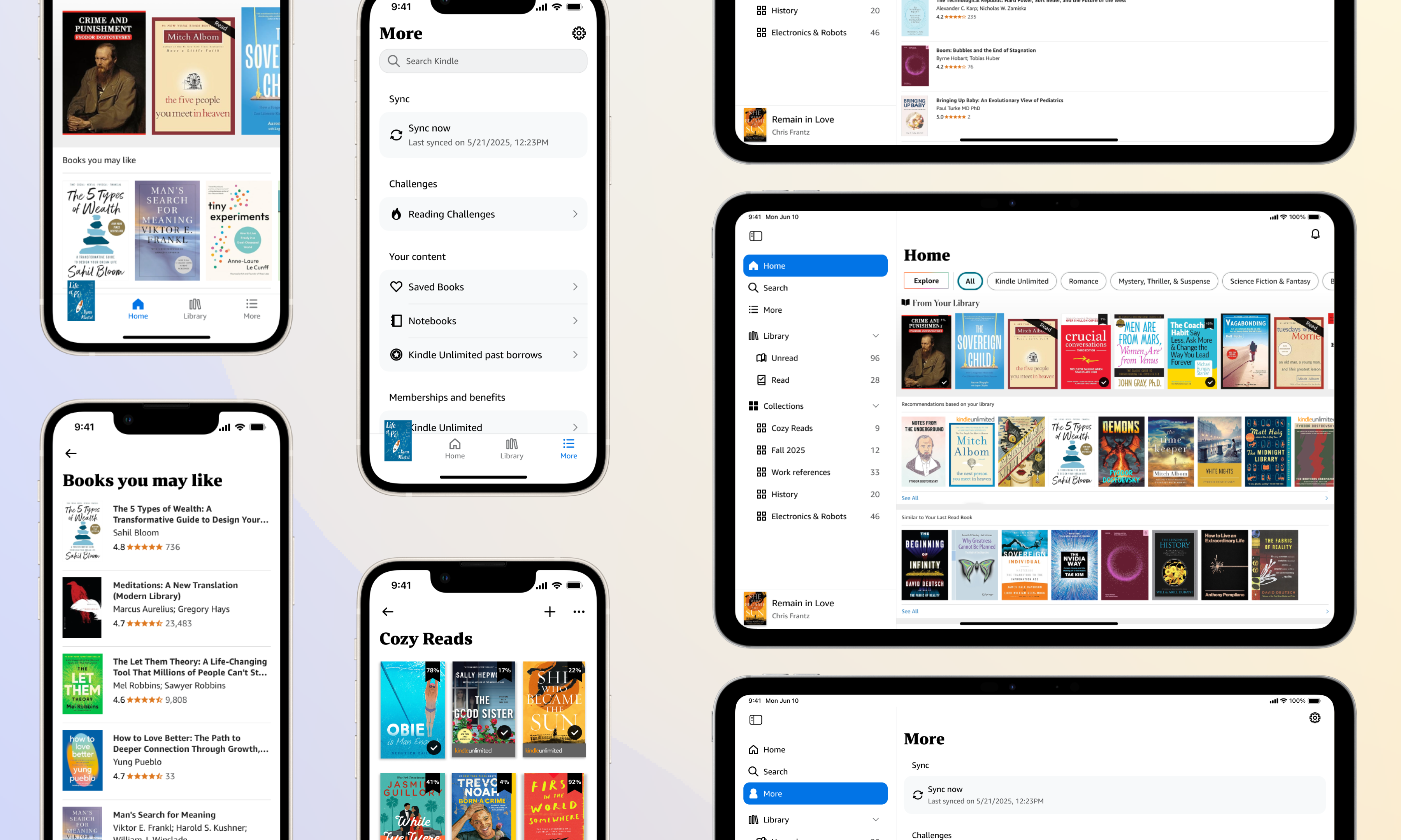
What I designed
I led the navigation refresh end to end across the Kindle mobile ecosystem, including iPhone, iPad, Android and Android Tablet.
The work included -
- a redesigned tab bar
- a unified navigation bar system
- a sidebar-like navigation model for iPad
- native list items
- supporting visual foundations across typography, iconography and color
I designed a new typography system, the icon system and all navigation elements. I also partnered on the color system as part of a small collaborative effort.
One important decision was what not to redesign. We retained a custom book in the tab bar that lets customers jump back into their most recently read title. I had explored broader concepts for rethinking that experience but chose not to absorb that additional scope into the navigation refresh. It preserved a behavior that was genuinely useful and product-specific while allowing the rest of the navigation system to move closer to platform conventions.
The goal was to be deliberate about where Kindle should feel familiar and where it should remain uniquely Kindle.
What changed
On iPhone, the app moved closer to expected platform behaviors with an improved navigation pattern, clear typography and iconography and revamped list items in the More tab with clear grouping of information.
On iPad, the information architecture improved. We surfaced read and unread books more directly so customers could get back to what mattered faster and the app began using the larger screen as an organizational advantage rather than just a bigger container.
Underneath the visible changes, the product became structurally simpler. What had previously been 10 or more navigation bar variants became a single unified navigation bar component. The same philosophy carried across the broader navigation layer with fewer one-off solutions, more shared components and clearer guidance in Figma so designers could build against a consistent foundation.
For engineering, that meant a more reliable codebase and a cleaner path for future improvements across device types. For customers, it meant Kindle felt less patched together and more at home on the devices they already knew.
Why native and not fully native
This project reinforced an idea I care about strongly - custom UI is only valuable when it earns its complexity.
Native components bring a lot with them such as accessibility support, mature interaction behavior, gesture logic, dynamic type handling and years of learned user expectations. Replacing those patterns with custom equivalents only makes sense when the product gains something meaningful in return.
In Kindle's case, some customization had become accidental rather than intentional. It was adding maintenance burden without adding enough customer value.
At the same time, this was not a story of blindly reverting everything to stock platform UI. The custom book in tab bar stayed because it supported a uniquely Kindle behavior. The iPad sidebar became a sidebar-like sheet because that was the best way to balance customer experience, platform coverage and long-term maintainability.
The design work was in making those distinctions well.
What it unlocked
This refresh rolled out to more than 20 million Kindle customers on iOS and iPadOS alongside the equivalent modernization work across 30 million Android devices.
But the deeper impact is that Kindle now has a stronger foundation for future product work. Engineering has a more reliable and extensible base to work from. And the product is better positioned to absorb future platform updates without needing to untangle the navigation layer all over again.